| GISdevelopment.net ---> AARS ---> ACRS 1999 ---> GIS |
Dynamic Linking of Arc View,
XGobi and XploRe for Multivariate Spatial Data: Linked Brushing for
Points, Polygons, and Lines
Nicholas J. Lewin-koh*,
Jiigen Symanzik and Dianne COOK
Graphics Lab
School of Computing
National University of Singapore
Lower Kent Ridge Road
Singapore 119260
Tel: (65) 874-6253 Fax: (65) 872-3919
E-mail: kohnicho@comp.nus.edu.sg
AbstractGraphics Lab
School of Computing
National University of Singapore
Lower Kent Ridge Road
Singapore 119260
Tel: (65) 874-6253 Fax: (65) 872-3919
E-mail: kohnicho@comp.nus.edu.sg
In this paper we present a dynamic link between Arc View, a desktop GIS, XGopi, a visualization program for multivariate data with well developed graphics tools, and XploRe, a statistical computing environment. Through a Remote Procdure Call mechanism we pass data dynamically among the three packages, thus enabling dynamic brushing to identify spatial outliers, to assist in clustering, and to apply various smoothers to the data for viewing it in relation to the map surface. The different views and tools supported by these packages provide unique insights into data when combined with the added layer of dynamic brushing. We show how we apply brushing in our implementation to point and polygon data, and briefly discuss linear data. We demonstrate how these tools give added insight into epidemiological data from health administration units.
1 Introduction
Spatial data set require additional tools for exploratory data analysis that are not always present in current Geographic Information Systems (GIS). Deficits in GIS become obvious especially when the data are multivariate and the dependencies within and between variables are of interest. There are, however, well developed techniques for the exploration of multivariate data such as the grand tour (Asimov 1985, Buja and Asimov 1986), scatter-plot matrices (Chambers et al. 1983) , and parallel coordinate plots (Inselberg 1985, Wegman 1990). However, spatial dependency cannot always be adequately visualized through these methods alone. In combination with these multivariate views of the data, dynamic maps play an important role in helping to visualize the nature of spatial dependence. With this in mind, we have developed the ArcView / Xgobi/XploRe environment. This is an environment that links three different kinds of software: a GIS, ArcView, a dynamic statistical graphics program. Xgobi (Swayne et al. 1998), and a statistical computing environment, XploRe (Hardle et al. 1995). The ArcView/Xgobi/XploRe environment allows the exchange of data and commands and provides analytic and graphical methods for the analysis of spatially referenced data in its geographic context. This environment has been successfully used for the analysis of precision agricultural data (Symanzik et al. 1998b), real estate data (Symanzik et al. 1997), and satellite images (Symanzik et al. 1998a). The linked software environment is available for major UNIX workstations such as Sun/Sparc, DEC alpha, and SGI. Additional examples that highlights the ArcView/XGobi component of this environment can be found in Cook et al. (1996) and Cook et al. (1997). A description of the technical components that form the basis of this environment can be found in Symanzik et al. (1999).
This paper focuses on modifications made to the ArcView side of the ArcView/Xgobi/XploRe environment to allow handling of data other than points and to elaborate on how the linked environment exploits the strengths of each package. We extend the functionality of the link to handle polygon and line data beyond the original capabilities to analyze only data at point locations. We use data on cancer mortality and economic variables from health services areas to illustrate our points. Due to space limitations and the importance of color graphics we are posting an extended set of figures at http:/www.public.iastate.edu/arcviewxgobi/ACRS/extended.html.
2 Point, Line and Polygon Data
In the earlier versions of the ArcView/Xgobi/XploRe environment only point data could be handled. Brushing in the ArcView map view occurred by changing the color, size, and type of the glyphs to match those used in XGobi and XploRe. Different groupings in the data are identified by different glyphs. In ArcView, this is done redrawing the points as graphics and manipulating graphics in the internal graphics list. Point data has fairly well defined metrics. Usually, distance is the Euclidean distance between two points, though other metrics also exist. The variogram cloud, multivariate variogram cloud, and the lagged scatter plot all use distance between objects as the basis of further calculations. When initiating the link, the ArcView script that calls XGobi first extracts the x and y coordinates of each data point and passes these coordinates as the first two columns of the data into XGobi. Then XGobi calculates the necessary values for the distance-based statistics from the data that has been passed from ArcView. The coordinates remain invisible to the user.
With only the capability of using points, it is still possible to examine data based on linear or a real tessellations. Polygons or lines can be converted to point layers based on the center points of the objects. Unfortunately, this approach does not provide a satisfactory view on the map view of the spatial objects. Information is lost regarding the topology of the map that one can see if the objects retain their original shapes. We follow with our approaches how to better handle polygons and lines.
In the most recent version of the ArcView/Xgobi/XploRe environment we added the additional capability to work with polygon and linear features. With point data, all features on the layer of interests are redrawn as graphics in the map view. Brushing takes place by manipulating objects in the view's graphic list. We use the same approach for polygons and lines. We redrawn polygons and lines as graphic objects on the screen. Brushing is accomplished by changing the fill color when objects are brushed. The data sent to XGobi, however, are still the coordinates of the polygon centroid or the center point of the line segment.
With polygons and lines, we run into some conceptual issues due to our representation in the data space of our a real units as points. In the case of point data , there is a one-to-one correspondence between the graphic representation in the data space and map space which allows us to manipulate glyphs and colors simultaneously. With polygons and lines, it becomes harder to match a glyph in the data view with a glyph in the map view if the polygon or line changes to a matching color. Currently, glyph brushing is disabled for polygon and line data types.
3 Epidemiological Example Using Polygon Data
The data set in this example has been taken from the Atlas of United States Mortality (Pickle et al. 1966) and consists of 798 Health Service Areas (HSAs) which are aggregations of adjacent US counties that share similar health service reporting characteristics. The variables used in this example are: a) the percentage of the population that is Hispanic; b) the per capita income; c) the percentage of households with a female head of household; d) the percentage of the population that is unemployed; and e) the mortality rate for all cancer types surveyed as deaths per 100,000. We want to investigate the relationships of these 5 variables in their spatial context.
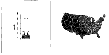
First, we look at some basic features of the data. In the basic link between ArcView and XGobi, we can examine the univariate distribution of each variable and bivariate relationships between pairs of variables. We note that the median percentage of Hispanics is 1.06. HSA units where the percentage of Hispanics falls below the median percentage (brushed in light grey) are in the midwest or deep south as seen on the accompanying ArcView map (see Figure 1). The values above the 75th quantile are all in the western US Examining this relation further we note that when we divide the HSA units into two classes above and below the median, there is a positive relationship among areas with greater than median, Hispanic population, unemployment, and the percentage of female heads of household. There is also a negative relationship between the percentage of the population that is Hispanic and the per capita income. The areas with the highest unemployment and highest proportion of Hispanics are, not surprisingly, southern Texas and central California.
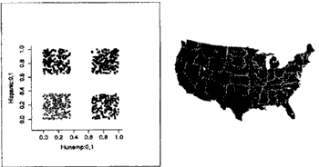
The relationship between unemployment and the percentage of hispanics seems to have a very striking spatial relationship (see Figure 2). Lower unemployment is distributed through the central United Stated while the northern and southern United States have higher unemployment. The hispanic population seems to be distributed throughout both types of areas with more of the population spread through high unemployment areas in the western United States.
To probe deeper into the relationships, we need to see the spatial pattern through the spatial noise. Using XGobi's built-in smoothing functions, we look at some of the bivariste relations with respect to our four previously created groups. The first panel in Figure 3 shows that cancer retes increase as the percentage of hispanics decreases both for high and low unemplyment, reinforcing our earlier assumption that cancer rates have some tendency to rise as the per capita income increases. We also note that areas with a
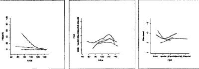
higher percentage of Hispanics tend to have lower per capita incomes. The last panel shows the complex relationship between the percentage of female head of households and the per capita income. We note that there are opposite trends for the high and low unemployment classes and that there are further differences in the low unemployment classes between high Hispanics proportions and low Hispanics proportions.
In general, we have seen that the hispanic population tends to have lower per capita incomes and lower cancer rates.
4 Summary and Future Directions
We have demonstrated some of the new features in the current versions of the ArcView/XGobi/XploRe environment, which include extending the data types handled by the link to spatial entities other than points. We noted some difficulties that are presented in brushing. We are considering several possibilities for future releases such as off-setting the brush color of the polygon so that the glyph would be visible, and thereby extending the number of distinct classes that could be brushed. However, too many classes can make map views too cluttered to distinguish patterns.
We would also like to extend both the distance metrics available and the number of features supported by the ArcView/XGobi/XploRe environment. Euclidean distance between centroid is not necessarily the most desirable distance between objects such as line segments and polygons. Often, adjacency and neighbor order are useful. For linear features such as rivers where flow is one way, an asymmetric distance would be useful.
One of the major restrictions for further development of the ArcView/XGobi/XploRe environment is that ESRI, the developer of ArcView, has focused their software development on the Windows versions of ArcVIew. Some of the enhancements available in recent Windows versions are not available in UNIX versions, such as the loading of external dynamic linkable libraries (dll's) to extend the ArcView functionality. When a function of interest is not a built-in part of ArcVIew and if is also cannot be linked into ArcView through dll's, implementing this function using ArcView's internal scripting language Avenue is still possible in most cases. However, when implementing such features using Avenue, a loss in performance typically occurs. For examples, calculating distance metrics such as adjacency for polygons using Avenue may be far too slow for a real-time application for data sets of moderate size. To avoid such and similar problems at least on some hardware platforms, we are currently investigating the issue to port the link to the Windows platform.
Acknowledgements
The work of Nicholas Lewin-Koh and Jiirgen Symanzik was supported in part through contract #99C903053 with the National Center for Health Statistics. Nicholas Lewin-Koh was also supported through a grant from John Deere to Dianne Cook. The article has not been subjected to the review of any of the sponsors and thus does not necessary reflect their views and, therefore, no official endorsement should be inferred.
References
- Asimov, D. (1985). The Grand Tour: A Tool for Viewing Multidimensional Data. SIAM Journal on Scientific and Statistical Computing, 6(1): 128-143.
- Buja, A. and Asimov, D. (1986). Grand Tour Methods: An Outline. In Allen, D. M., editor, Proceedings of the 17th Symposuim on the Interface between Computer science and Statistics, Lexington, KY, pages 63-67. Elsevier.
- Chambers, J.M, Cleveland, W.S., Kleiner, B., and Turkey, P.A. (1983).Graphical Methods for data Analysis. Wadsworth & Brooks/Cole, Pacific Grove, CA.
- Cook, D., Majure, J.J., Symanzik, J., and Cressie, N. (1996). Dynamic Graphics in a GIS: Exploring and Analyzing Multivariate Spatial Data Using Linked Software. Computational Statistics: Spatial Issue on Computeraided Analysis of Spatial Data, 11 (4) : 467-480.
- Cook, D., Symanzik, J., Majure, J.J., and Cressie, N. (1997). Dynamic Graphics in a GIS: More examples Using Linked Software. Computers and Geosciences: Special Issue on Exploratory Cartographic Visualization, 23(4):371-385. Paper, CD, and http:/www.elsevier.nl/locate/cgvis.
- Hardle, W., Klinke, S., and Turlach, B.A. (1995). XploRe: An Interactive Statistical Computing Environment. Springer, New York, NY.
- Inselberg, A. (1985). The Plane with Parallel Coordinates. The Visual Computer, 1:69-91.
- Pickle, L.W., Mungoile, M., Jones, G.K., and White, A.A. (1996). Atlas of United States Mortality. U.S. Department of Health and Human Services, Centers for Disease Control and Prevention, National Center for Statistics, Hyattsville, MD.
- Swayne, D.F., Cook, J., and Buja, A. (1998). XGobi: Interactive Dynamic Graphics in the X Window System. Journal of Computational and Graphical Statistics, 7(1):113-130.
- Symanzik, J., Cook, D., Klinke, S., and Lewin, N. (1998a). Exploration of Satellite Images in the Dynamically Linked ArcView/XGobi/XploRe environment. In Bodt, B.A., editor, Proceedings of the Third Annual U.S. Army Conference on Applied Statistics, 22-24 October 1997, pages 23-23, Aberdeen Providing Ground, MD. Army Research Laboratory ARL-SR-74.
- Symanzik, J., Cook, J., Lewin-Koh, N., Majure, J.J., and Megretskaia, I. (1999). Linking ArcVIew 3.0 and XGobi: Insight Behind the Front End. Journal of Computational Graphics and Statistics, In Press.
- Symanzik, J., Klinke, S., Schmelzer, S., Cook, D., and Lewin, N. (1997).The ArcView/XGobi/XploRe environment: Technical Details and Applications for Spatial Data Analysis in the Dynamically Linked ArcView/XGobi/XploRe environment. Computing Science and Statistics, 29(1):561-569.
- Wegman, E.J. (1990). Hyperdimensional Data Analysis Using Parallel coordinates. Journal of the American Statistical Association, 85:664-675.