| GISdevelopment.net ---> AARS ---> ACRS 1991 ---> Forestry |
Graphical techniques for
component type: A case study
Dr. Omar Mohd. Rijal
Dept. of mathematics, university of Malaya
Ismail harun forest research institute of Malaysia
Norliza Mohd. Noor
Malaysian centre for Remote Sensing Ministry of Science
Technology and The envoronment Malaysia
Dept. of mathematics, university of Malaya
Ismail harun forest research institute of Malaysia
Norliza Mohd. Noor
Malaysian centre for Remote Sensing Ministry of Science
Technology and The envoronment Malaysia
Abstract
The arbitrary nature of applying statistical data analysis methods in studying remotely-sensed images create “uncertainty”. By “uncertainty” we mean any “activity” that could bias our final conclusion; for example assuming unimodality in histogram instead of a mixture of histogram. The following study attempts to reduce particular forms of “uncertainty”.
This paper illustrate the problem of determining component type. A test area has been chosen to be studied using conventional software employing band 1, band 2 and band 3 of SPOT data. Statistically, mixture distributions are of interest, and statistically, mixture distributions are of interest, and particular attention paid to the determination of the number of components. This paper will emphasize informal graphical techniques. We take a critical look in the usage of histograms of gray levels. A brief review of other (graphical) techniques is given. Particular practices ( example assuming normality ) in remote sensing will be discussed.
Introduction
- Image Data
Agricultural land in pasir Gudang, Johor ( our test area ) is being converted into industrial use at a rapid pace. Identification of type of land use is required for development of the pasir Gudang area. The digital image of pasir Gudang was obtained from SPOT using band 1, band 2 and band 3. The area covered is about 3095 x 3095 pixels. Statistical classification of histograms will be used to identity types of land use.
- Classification using histograms:
The histogram of gray – levels ( 0-255 for our data ) can be used to indicate ( perhaps suggest) the number of component types. If each component is represented by a hump (distribution), several components will be represented by several humps ( a mixture Distribution ), see for example Everett and Hand, ( 1981) Where we may have the linear combination of three normal distributions. Visually, a hump is seen to exist by the presence of a mode ( or peak). Unfortunately, unimodality does not imply it is not a mixture, so the histogram can be deceptive.
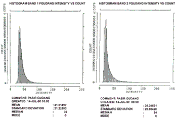
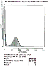
Figure 1
Clearly histogram band 1 ( henceforth referred to as HIST 1) and HIST 2 visually suggest uni-modality whilst HIST 3 suggests the existence of 2 modes. The inference could therefore be that HIST 1 and HIST 2 suggest some form of uniformity for the test area whilst HIS 3 suggest otherwise. We propose the following procedure to investigate unimodality.
- Hypothesis testing of histograms
- Using the techniques of Bhattacharya
- Density estimation techniques.
(i) Hypothesis testing
Let us represent the histograms by
{ Xj’ fi (Xj); J = 1, …, k; I = 1,2,3 }
Where Xj is the midpoint of each of k classes ( or bandwidth ), and Fi (Xj) the corresponding coll-frequency. The subscript I denote the it Band.
Comparison of two histograms involve considering
Dflm = fl(x) - fm(x); l=1,2,3
where the non-parametric Sign Test is applied to D F (X).
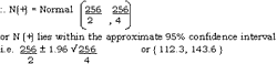
Let N (+) = number of times Dflm(X) is positive.
Let q = probability fl(X) > fm(X).
Clearly N (+) » in (k, q) where K = 256.
The hypothesis to be tested then is;
Ho : q = 0.5 "S H1 : q ¹ 0.5
Accepting Ho : o = .5 implies equality of the Histograms
{ i.e. samples from fl(X) = fm(X)} We use the normal approximation to obtain the critical cut-of points;
i.e. N(t) » Normal (kq, Kq( 1-q) if Ho is true,
Result:
comparing Hist 1 and Hist 2, N(+) = 215
Hist 2 and Hist 3, N(+) = 154
Hist 1 and Hist 3, N(+) = 156
Clearly in all three cases N(+) lie outside the 95% confidence interval, implying we reject Ho, or all three histograms are significantly different,
(ii) Bhattacharya’s ( 1967 ) technique
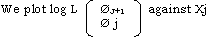
Where qm and qj+1 are the observed frequencies of adjacent classes J and J + 1, and Xj is the mid-point of class J. The plot yields a series of approximately straight lines with negative slopes, each line corresponding to an area where one component dominates.
Restults
a) Band 1. (See figure 2 )
Between intensity 20 and 40 there appear to be two linear trends suggesting two peaks but very close to each other. Above intensity 40 no linear trend (with negative slope ) is seen; clearly caused by having a “long tail” on the right of the histogram.
(b) Band 2 ( see figure 2 )
Similar to Band 1.
(c) Band 3 ( see figure 2 )
Between intensity o and 20 exists one linear trend with a sharp slope. Between intensity 40 to 120 is an almost horizontal line with a “slight” negative slope ( the symmetrical hump in histogram ). The fuzzy points above intensity 200 is due to having small frequencies.
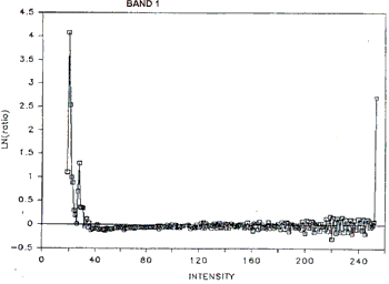
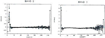
Figure 2
(iii) Density estimation techniques
Given a sample or data set, sya X1,......., Xn ( some of which may be repeated values ) we may estimate the true probability density function by using, for example.
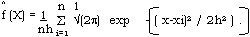
where H = window width. A discussion of density estimation techniques is given in silverman ( 1986). The test for unimodality involves finding a critical value h where ^f(X) changes from unimodal to multimodal. ( seel Silverman ( 1986, chapter 6).
The study using this method has not been completed, but shall be reported else were.
Discussion / Conclusion
This visual interpretation of histograms has been shown to be potentially misleading. In particular the number of peaks to represent the number of component type is not obvious, hence uncertainty and bias are inherent in our inferences.
The simple hypothesis testing performed showed that all three histograms are statistically different. This is to be expected as they are constructed from different Bands. On the other hand the graphical technique of Battacharya suggests all three histograms having two peaks each.
However, as the test area comprise of industrial, agricultural and residential areas we would expect more than two peaks. This indicates the weakness of the Battacharya technique in particular not being able to differentiate humps which are very similar ( close to each other ) our sttempts at this problem, via density estimation techniques remain to be reported at a later date.
Other graphical techniques for determining humps exits, in particular that of probability plotting, see Everitt ( 1978 ). However studies on such plots have been mainly carried out for normal mixtures.
We conclude by emphasizing “CAUTION” as a practice in interpretating histograms. It’s limitations must be understood, more so when other assumptions ( Such as assuming normally distributed data ) are made.
Acknowledgements
The computer facilities of The Malaysian Centre for Remote Sensing was used for this studies. The authors expressed gratitude for suggestions from Mr. Mohd bin Omar, University of Malaya.
References
- tacharya, C.G. ( 1967 ). “A simple method of resolution of a distribution into Gaussian components .” BIOMETIRCS, 23., 115-35.
- Everitt, B.S. ( 1978). “Graphical techniques for multivariate Data”, Heinemann. Landon.
- Everitt, B.S. and Hand, D.J. ( 1981). “Finite Mixture Distributions”. Monograph, on Applied Probability and statistics. Chapman and Hall.
- Silverman, B.W. ( 1986). “Density Estimation for Statistics and Data Analysis”. Monographs on Statistics and Applied probability. Chapman and Hall.